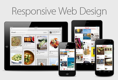
With so much competition in the online market, you want to be sure that your website will be accessible to everyone who might be interested in your products or services. And since you cannot know everything about your potential visitors, you have to be adaptable to their needs. This means that you need to have web design in Belfast that will work for people who use desktop computers, laptops, tablets, and smartphones. Two relevant types of web designs for you to think about as you are considering your website needs are mobile and responsive web designs.
A mobile web design will be a scaled down version of your site designed specifically for use on a smartphone. It will not look exactly like your desktop website, in order to accommodate the different features of a smart phone. This means that it can have the same content as your desktop website, but should be organized in a different way, according to what will be most user-friendly for your customers who access your site through their smartphones.
A responsive web design is very different in that it will be the same as your desktop website, but it will automatically scale itself down when it is used on different sizes of screens. Have you ever been on a website on your smartphone in which you had to scroll endlessly both down and to the side to get to a part of the content, even though it had fit on one screen on your laptop? That is an example of a site that does not have a responsive web design, and we know that it can be annoying from the user end of the site–and you probably have discovered that, too. A responsive design knows what type of device visitors to your site are using and adapts to that immediately, giving your visitors complete access to your website content.
If you have any forms on your website for visitors to fill in, without the right web design you will find it difficult to get smartphone visitors to participate because the form will not resize itself to fit onto any screen. Smartphones are meant to be a convenient, efficient way to find information and access services, and anything that might slow down the smartphone user’s experience may cause them to look for an alternative site.
So if you are looking to create or revamp your website in Belfast, contact BCS Web Design so you definitely start caring about your mobile users. Once you get visitors to your site, however, they got there, you want them to want to stay.
