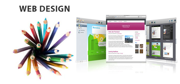
The web design is very dynamic, constantly changing depending on various trends that appear anywhere. As we renew our storefront in a traditional business, doing so should go on our website, which is our online showcase. So today we will look at five trends in web design for 2014.
This does not mean we have to follow them all, but rather, we seek to have a corporate website that best meets your function, whether it informative or help us sell. In any case we should try to reflect the image we want to project our company, for customers who already know us and those who come to it for the first time.
5 Web Design Trends for 2014
- Run away from the boring fonts that do not reflect the personality of our company. This is relatively easy to achieve, but ultimately end up many pages always use the same fonts, templates made that ultimately make our offer is similar to the competition, at least as far as aesthetics are concerned .
- Adaptation to the screens of mobile devices, which is increasing, both on the side of the mobile terminals and tablets for content consumption at home. Our website must be viewed and handled correctly both from a desktop computer with keyboard and mouse, and from the screen of a mobile phone with touch operation.
- More video instead of text, a trend that is growing where if we analyze the time spent on our site you will see that very soon. So better to create a video under a minute where the virtues of our company or our product to try to explain retain you to visit us.
- HTML5 is the language in which they are building modern pages today. However, many older pages company not using it and this is being felt more and more. The possibilities that HTML5 gives us make it which is really essential, especially if we want a dynamic page elements like flash unused.
- Large areas of introduction that occupy almost the whole screen, which partly come to replace the sliders. This is an area, especially graphic, but also with text where we will introduce our company. This trend we have seen in many pages in 2013, and will remain important in 2014.
It is important to see that we have to renew our budget web, if you have to start from scratch or get a new design or is not within our means. We can always opt for less aggressive plans with small redesigns that adapt and modernize the corporate website, but which do not start from scratch.


No Comments
Leave a comment Cancel